Friday, November 27, 2009

More Cool Mail.

A while back I joined Twitter for the sole purpose of entering a contest hosted by World Famous Design Junkies. The prize for this contest?

STICKERS, GLORIOUS STICKERS!!!!!!!

More specifically, the stickers were part of another contest run by Sticker Robot. The Sticker Robot contest gives a topic, and asks for sticker slogans based on that theme. The winner gets 500 of their sticker printed, and Chris Burns of World Famous Design Junkies is a winner! His slogan "OBAMA ON A UNICORN LOOKING FORLORN" makes me wonder what the theme of the week was over at the ol' Sticker Robot, because I don't get it.

That really doesn't matter too much to me though, because if you know me, then you know I LOVE stickers and zines. If you don't know me, then maybe you should, we could play Super Mario Kart. But anyway, I entered the contest and I won!
The photo above is what the package that arrived in my mailbox today looked like. Just your average, run of the mill envelope right? WRONG!!!!!! Like I mentioned in my last post, I love getting mail that is artistic, and includes bonus stuff, and this package did not disappoint. BOOM! That plain looking envelope turned into this!
As you can see, the envelope was really a cardboard photo frame, with a picture of an unknown dude, from an unknown time. Weird, but very interesting, and a very unique use of an old photograph/photo frame. I should have expected nothing less from a design website. That's not all though! The package also had BONUS STICKERS!!!! Tons of little stickers from A Tiny City, (a blog related to the World Famous Design Junkies family) a few graffiti art styled stickers, and 16 Obama on A Unicorn Looking Forlorn stickers. Score!

Tuesday, November 24, 2009

Zine of the Month Club.

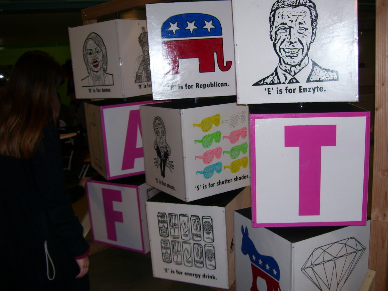
Recently thanks to printeresting.org I discovered something called the "Zine of the Month Club". For $75 you get a different zine every month from Mark Price/Space 1026 in Philadelphia, PA. Each issue is by a different artist or by a collection of artists, and usually features lots and lots of unusual doodles and drawings.

The Zine of the Month Club is why God invented mail. The picture below shows everything that came in the mail with my first zine of the month. It included all the previously released zines, as well as 3 show cards for an art auction/gallery opening at Space 1026, the envelope with the pizza character printed in red, a flier for the zine of the month club, a full color pizza character card with a hand written note from Mark Price, and all the zines up to that point.
Even though I wouldn't be able to make it to the show in Philly because it is over 8 hours away (I'm guessing), it is still cool to get bonus stuff in the mail, especially if it is really well designed. The envelope could have been plain white, and he didn't have to send a note saying thanks, but he did, and it's cool to know that he is not just phoning it in when it comes to this project.
A few weeks later I got the October issue. Same thing. The envelope was printed with the pizza figure, a new zine inside, and a cool little flier telling people to "READ ZINES NOT BLOGS". I think you should do both. Read zines, and this blog...and printeresting.org...and worldfamousdesignjunkies.com...but that is IT!

A couple of weeks (maybe not even that long!) later, I got a new envelope from the Zine of the Month club. This one was in a plain white envelope, with a photocopied zine called "Puke".
Because of its size, envelope, and photocopied nature, I don't think it is supposed to be one of the "official" zines of the month, and is more than likely just another form of "Thanks for subscribing" from the Club. If it is one of the official months titles, it is ok with me. What it lacks in fancy colors, and size, it makes up for in hilarity. This zine is probably one of the funniest yet. While I am talking about this zine in particular, it would make sense to go into greater detail about a few more as well.

Almost every issue is screenprinted, or a mix of screenprinting, photocopy, and interesting paper choices.

By interesting paper choices, for example, I mean that "Some kind of way" has velum paper for the 1st and last page that makes the image of a woman falling, turn into an organic pink blob when the page is turned. The cover to this one also blew me away, and made the screenprinting part of my brain wonder "how did you do that?" The drawings inside are kind of psychedelic, and have a really nice variation of line quality.

"Draw Jams Vol. 1" has a harder glossy cover with photographs of fat cats all over it, and the inside is filled with various artists' takes on Garfield, Batman, and other unusual characters.

"First Casualty of Pom Beach Week" is full of drawings of women and pomeranians. This is probably what a bad trip is like, and judging from some of the smoke-filled drawings, that may not be too far off.

"20xx" is a very elaborate, very high quality zine that makes my photocopied zines, and my screenprints, kind of look like crap. It actually has a zine within a zine!

"Hell Hath No Fury Like a Woman Scorn'd" is the only one that has a straight forward narrative to it, and it manages to flip that on its head through the unique way in which it must be read.

"People Friends" is a full of small drawings of people, and creatures, just chillin' and saying unusual phrases out of context. Very fun, and lots to see and read.

The rest of the zines follow along similar lines. Each issue that comes in the mail has its own unique identity, and its own way of interpreting art of the zine.

At www.zineofthemonthclub.com you can see the issues so far, subscribe to this year (or next year for the discounted price!), or click on each issue down the right hand side of the page to get a quick flip through of the issue. Even if you don't want to subscribe, it is worth it check out the site just to flip through all of these great zines.

Friday, November 20, 2009

Southern Graphics Conference/Hatch Show Print Internship

Looks like it is that time of year again!! The Southern Graphics Council's conference has just released the info for the 2010 conference. This year it is in Philadelphia and just from looking at the info on the website it's gonna be a good one! Going to this conference in Chicago (2009) with my printmaking class was probably the best experience of my college career.

This year since I am no longer a student I can't go to the conference on the University's dime. It looks like the $200+ for registration, membership, travel, room, and food may not be the only thing that may prevent me from going to the SGC this year, because I got the internship with Hatch Show Print in Nashville. Thats right! From February 15th-April 16th I will be living in Nashville, four hours further away from Philly than I would have been in Louisville.

I have been thinking that if by some miracle I manage to scrape enough money together to live in Nashville on my own, and then somehow get enough money together to go to the SGC conference, then maybe I can take a weekend off from Hatch and drive up there. I think I get weekends off with the Hatch internship, but I could be wrong.

Here are some pictures of Hatch Show Print in Nashville (1-3) and pictures from my trip to the Southern Graphics Council (not including the pictures of people doing somersaults, eating Epic Burgers, or making weird faces).


Wednesday, November 18, 2009

Misplaced Groceries

If you are like me, then you work retail. If you are also like me, then you eat food from a grocery. I mean, you might not be like me at all. You might be a robot, or maybe a vampire so you don't have to eat grocery bought food. You could eat a bucket of bolts, or the blood of a Twilight fan. Whatever. I'm getting off track here.

So there is this really cool printing company called Aesthetic Apparatus in Minneapolis. They do screenprinted show posters and really cool art prints, but besides the really cool prints (that you should check out), they have also made a book called "Misplaced Groceries". This is a book of photographs taken inside of grocery stores where an object has been taken out of its "front and faced" environments and abandoned in another location.

Most of the products look as if they are trying to fit in with the other products. If anthropomorphism were to be applied to the products, the shelves could be seen as social situations, where some products seem to be scared, confused, pompous or proud. Some products seem to be judging the objects imposing on their turf. For example: the green dish soap sits with the Mountain Dew 6 packs but being the same color is not enough to be included in the pack, or even the same shelf as the 6 packs of soda. The dish soap is not Mountain Dew, or in a six pack, and the bottles have different tops, and different shapes.

For me, working in retail, and eating food from groceries (see we're getting back on track) I see this kind of stuff all the time! At work it makes me wonder "how can people be SO LAZY!?!?" but in the grocery store it's sort of funny.

"How did these Popsicles get next to the toilet paper?"

"Who dropped toothpaste in the milk section?"

My personal favorite probably is when there is just random meat left somewhere. Like when you see a pack of ham in the magazine rack, or a pound of ground beef on a shelf of cereal. Hilarious! I wonder if they try to resell it, or how long it sits there before it goes bad, or before someone finds it. Anyway check out the pics. Here is the address. Misplaced Groceries My favorite is probably the Diet Coke in the hair dye section.

Tuesday, November 17, 2009

'Zines

(NOTE: This was originally going to be a post about the zine of the month club, but I got carried away.)

I like 'Zines. There I said it. There is nothing to be ashamed of really, but it seems sometimes that I was born about 10 years too late. Its like I should have been going around in my 20's during the 90's wearing my flannel shirts and ripped jeans, brushing my long orange and green hair out of my face while wearing my favorite Pearl Jam t-shirt. You could find me slaving over a hot copy machine at the local Kinko's (not FEDEX Kinko's) printing out page after page of my latest art masterpiece. Folding and stapling with a sense of pride for this rough product about to be unleashed on the world.

I never did any of those things though. Except for the flannel shirts, and the jeans with holes. It wasn't about fashion, I was just a poor teenager. I didn't make my first 'zine until 2003 maybe? It was for my drawing II class. It seems there really aren't too many zines out there these days. I think it is a combination of there not being too many being produced locally, or it could be that I just don't know where to look. It could be that I have a certain romanticized idea of what a zine should be based on the comics of Adrian Tomine, Jim Mahfood, and Daniel Clowes (Zine-o-phobia in Ghost World?). Cool drawings, cool stories, maybe an album review, or movie review. I would think that 90% of my love of zines is probably related to me collecting comic books(especially the smaller sized and often roughly drawn Ashcan and underground comics), always thinking that one day it would be ME writing and drawing and publishing my own work. This was attainable in the form of the zine. Even if I gave up on that dream during my first year of college.


I remember Brat magazine and Burt the Cat, in Louisville. Both of these were collections of stories, funny pictures, comics, and ink that came off right on your fingertips. Brat was a lot more political, and rebellious with its articles along the lines of what to do if you get pulled over, and violence in schools, and self education. Meanwhile, Burt the Cat was more local around town things, and funny pictures and websites(and the website had better be good because you still had to dial them up!). It seemed like so many zines, or local publications were so musically geared that it was very selective. I remember seeing a lot of things with interviews or reviews of bands and albums that I had never heard of, or just didn't care about. I suppose that is why zines are often called "fan-zines". It is supposed to be for a small audience of the initiated. If you didn't know what they were talking about, then it wasn't for you.


A few years after the drawing II assignment to create our own zines, I started to seek out new and interesting zines from the internet. I got a few things from Rob Ullman, which are mainly pin-up style cartoons and other assorted drawings and comics, but that was it. I made a zine for one of the Big Bone art shows which was all about my saint prints, and one for my BFA show. It wasn't until earlier this year when I went to the Southern Graphics Print Council Conference in Chicago that I found zine heaven. There were people who were self printing zines left and right! The Colombia college store had a zine called "Bitches" Which was sold in the store as a "zine", but under the guise of "one page artist book" during a Demo one floor up. It was in reality a photocopied piece of paper that was folded in a very creative way. "Claptrap" #2 was hilarious and screenprinted which was a bonus for me! Another great one is the CD-booklet-sized-gold-covered "The Longest Night" by Lederer, Lake, and Singer. I got this in Chicago also, and it is very sturdy in its construction, and the drawings inside are great as well. Recently I discovered a club called the Zine of the Month Club. For 75 bucks you get a different zine every month. It really is a cool deal. They are from a variety of artists, and published by Mark Price. When I say "published" I mean that 90% are screenprinted. (I will go into more detail about this group of zines in a later post.)

There is something about holding printed paper that can not be reproduced on screen. A Kindle from Amazon will never be a book, with a cover designed by someone, and a font that someone had to pick, or a smell, or the feel of the paper. A kindle will always feel like a kindle, and no matter what book you read it will feel, and smell the same. The same goes for Albums. You will never hold a digital download in your hand, and you will never read the digital download liner notes. You will never smell the ink, or feel the texture of the paper. Is it glossy? Is it rough? The same is DEFINITELY true about comic books. It makes me laugh to think that some comic companies are pushing so hard to go digital as the future of comics. I just don't see that catching on. Much like these mediums, a Blog will never be the same experience as a 'zine, or a magazine, or newspaper. There is the touch, and the smell aspect, but there is also the feeling while holding a zine, that someone somewhere thought this was important enough to cut, paste, write, draw, and copy. This is someone's product, and it is more that a simple layout where they fill in the blank insert HTML and hit "post" You can see the craft, and you can see the screw-ups, and in both cases it is a sign that there are still people out there getting their hands dirty.

Monday, November 16, 2009

Talking Heads Monoprints

Today I continued to refine my mono printing by creating these two prints. They are both based on the titles of songs by Talking Heads."Psycho Killer" 2 color monoprint "Love->Building on Fire" 3 color monoprint

"This is a Printing Office"-Beatrice Warde 1900-1969

THIS IS
A PRINTING OFFICE

CROSSROADS OF CIVILIZATION
REFUGE OF ALL THE ARTS
AGAINST THE RAVAGES OF TIME
ARMORY OF FEARLESS TRUTH
AGAINST WHISPERING RUMOR
INCESSANT TRUMPET OF TRADE

FROM THIS PLACE WORDS MAY FLY ABROAD
NOT TO PERISH ON WAVES OF SOUND
NOT TO VARY WITH THE WRITER'S HAND
BUT FIXED IN TIME HAVING BEEN VERIFIED IN PROOF
FRIEND YOU STAND ON SACRED GROUND
THIS IS A PRINTING OFFICE

Saturday, November 14, 2009

Monoprint Test.

The last time I make a monoprint was probably 4 years ago during my "Intro to Printmaking" class. For those monoprints we used plexiglass with ink brushed on like a painting and then manipulated with water to get the image we wanted and then ran it through the press. It was more like painting, and the results were ok for me, but I wasn't impressed. I much preferred screenprints, and woodcuts. A few semesters later there were two students doing some amazing things with monotypes, that I had been interested in, but had never tried. My interest was mainly in mastering screenprints, and making a series in that medium. Tonight I decided to try my hand at this form of monoprinting. Making monoprints this way are a cheap and easy way to make unique prints at home. Monoprinting in this way requires no press, chemicals, light tables, spray sinks, screens, acid baths, aquatints, etc. All you need to make prints is a brayer, ink, a pencil or pencil like object, paper and a surface to ink up, such as a small piece of glass, or block of wood. Using your brayer apply a nice coat of ink to the surface. In my case this was a piece of cardboard, woodblock, and glass. The type of surface you use with determine what type of texture you get. Cardboard often has ridges, while wood has a grain, glass is often the smoothest surface with the least amount of texture to it.

After you ink the surface place a piece of paper over the inked surface. Then trace your image, or freehand draw it with an object such as a capped ink pen, end of a pencil, or even with a drawing utensil(though this will leave an image of the drawing on the back as well as the front.) Then peel the paper off of the surface and you (hopefully) get a great image with an interesting texture and very distinct line quality. The main thing that differs monoprinting from other printing methods is that with this process you can't really edition your prints because each image is different and unique even if you trace the same image over and over. This may be obvious to you based on the name alone.
The images you see above are the results from tonight's monoprint tests. With the monoprints I completed tonight (or maybe started) I see a lot of potential for really good looking images, particularly the skull drawings. If I were to go back with another color to accent the original image this could be the start of something really amazing.

Thursday, November 12, 2009

Art Is Hard...But Worth It.

So, I originally called this blog "Art is Hard", but that is misleading. It is hard, but it is totally worth it. So while looking for another clever name to change it to, I stumbled across a list of printmaking quotes...Cause thats what I do. I make prints. I am born to make prints. So maybe I will change it to that, or maybe not. Its too late to make a decision like that.

So after finding these great quotes, it turned out I had the title in my head all along. Anyway, here are the best of the quotes I found. I like the love-hate relationship that a lot of people seem to have with the art of printmaking, and also the sense of humor about their craft. That's the way life should be. Love. Hate and Jokes...But without the hate, and lots and lots of really cool art to look at.


"I go to my studio everyday because one day I may go and the angel will be there. What
if I don't go and the angel comes?"
- Phillip Guston

"Printmaking is like a man who treats you badly, but you keep coming back!"
- Jenny Mathews

"Print like a vicious dog!"
- E. C. Cunningham

Printmaking is fun because it takes a perfectly simple process like drawing and makes it
as complicated and error prone as possible."
- George Bodmer

"If you know what you're doing, you're wasting your time."
- Buckminster Fuller

Print is dead."
- Dr. Egon Spengler, Ghostbusters

"You have to be somewhere at 8 o'clock in the morning everyday of your life, you might
as well be in the print shop."
- Fred Brian, Illinois Wesleyan University

When questioned about the exact reproduction of all prints in an edition, one should
reply: "Why, are you going to buy two of them...?"
- Ken Hale

"The proof is in the proof."
submitted by E. C. Cunningham

"Printmaking is hard work."
- SIUC print studio, on a sign, in red, white, and blue, with USA map
submitted by Ray Noelle

"Printmaking rocks."
- origin disputed, Millikin University, ca. 2001, as a result of listening to the
Stooges while printmaking
submitted by Ray Noelle